This particular album has been driving me nuts for about two weeks now.
Today I just couldn't take it anymore. I coyly placed this album behind the rest and then my typography nerves rested a little easier.
Now, hear me out. I adore Miss. Swift. This is in no way an attack on her upbeat crazy catchy tunes, or her crystal clear persona. This is a "there is your sign" moment for these designers.
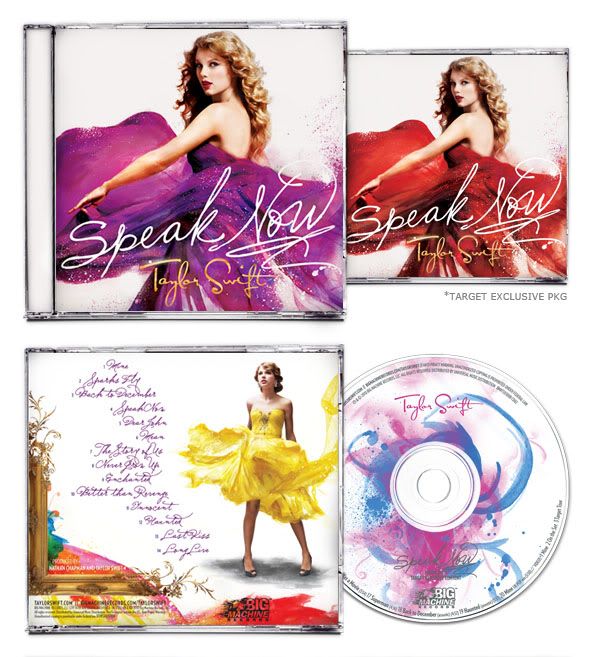
I love the back, the textures are executed beautifully and I envy their mad skills here. The front, I have issues with. Miss. Swift has been rocking that curly cue logo for quite some time now. It is pretty much iconic as far as country music goes these days. The logo stands. So why in the WORLD would you pair that logo with yet another, hand drawn font. Kill me. I can't take it. My eyes are literally having a wtf moment. They have no idea where to go. So today, I allowed my eyes to rest, and politely put the album behind a more appealing one.
Miss. Swift, great album, love the songs. Next time, make sure your design team has conflicting aesthetics. Your album artwork will be better for it.
I feel much better now.
{image cred: The ST8MNT Blog}
Punctuate away,
Jessie-Lee