Pages

Thursday, September 30, 2010

Land Carpet

No, I mean that verbatim. Land carpet. Austrian-born designer Florian Pucher has been influenced by satellite images of countryside all over the world. In turn he designs some pretty sweet area rugs based on the images. I would kill to have one of these in my living room. They are gorgeous!


Just imagine how cool one of these would be in your living room. I am especially loving that middle one, with the pops of purple. All of these designs are based on different regions of the globe. For more info and more gorgeous pictures be sure to check out his website here, as well as the original posts on decor8 and Life.Style.etc.

{image cred: Florian Pucher}

Punctuate away,

Jessie-Lee

P.S. LC design alum, how much do those farm animals on this rug remind you of Pumphrey and his cutouts? Haha! That always cracked me up! My projects were always turned into buildings by that red sports car. Oh the memories.  

Wednesday, September 29, 2010

Paint by Number

I saw these on sfgirlbybay today and I fell in love. How cute! The US map image is so unexpected from a paint by number. Can I have six of these in a grid on my wall? I would love that!


This is one of the most original things I have seen in a while. If you want to view more of these lovelies, click here to check out somethings hiding in here's flickr photos. And if you are feeling like you have some deep pockets today, check out their Etsy shop too.

{image cred: somethings hiding in here Flickr via sfgirlbybay}

Punctuate away,

Jessie-Lee

Papillon

I know, I know butterflies are so sixth grade. Don't lie, I know you had the embroidered jeans and the twin set tops decorated with the things. Well I did at any rate, and they were the coolest thing ever!

I have posted about butterflies before, but I promise this is in a much different manner. No butterflies were harmed during the production of these images. It is purely synthetic.

With that said, butterflies have an innate sense of beauty. I think that is why they are seen as treasures. They are also represent the purity involved in transformation. This is why I think they are a perfect theme for a wedding. But, only if it is done right! We all know how corny this theme can get, just think about the wallpaper in your Grandmother's kitchen. Ick!

Well here is how you do it right; cake, dress, invites and bouquet, with class not corny!


These in no way look like Grandma's wallpaper. I think these idea are some great alternatives to some traditional wedding details.

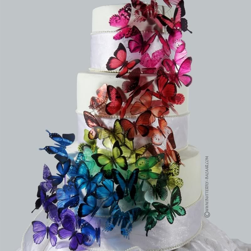
I am really loving that cake. I found a great Etsy shop, BUTTERFLYBAZAAR that provides this particular color way as well as monochromatic ones. And they are very reasonably priced. Just think how much cheaper it would be to get a plain white cake and then add these beauties to it. You could spend the savings on some awesome fillings (mmmmm!).

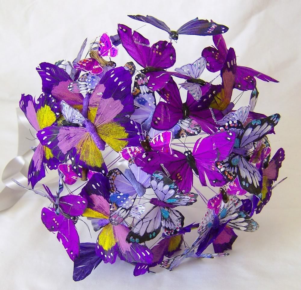
I also enjoy the idea of this alternative bouquet. Unfortunately my wedding bouquet was lost, along with one of my Mom-Mom's handkerchiefs before we left the venue the next morning. Very, very sad. This type of bouquet doesn't need drying, or preservation, it can stay beautiful in its original form forever! How great of an heirloom piece would that be? Thank goodness for Etsy vendors and idotakeu.

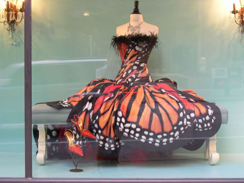
That dress! Enough said. Insanely beautiful. From Luly Yang Couture.

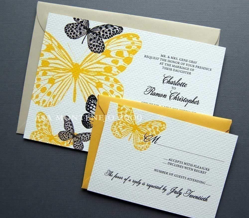
The invites. This is how you do butterflies non-corny. The invite is kept simple and the detail shines in the two tone butterflies. Brilliant! From inkylivie.

{image cred: in order of appearance, 1, 2, 3, 4}

Punctuate away,

Jessie-Lee

Tuesday, September 28, 2010

Personalize It

I will admit, I have not been on my Etsy game lately. I have really been trying to get back to my roots and show you a lot of graphic design. The only problem is its not really working. Laying down the law to only hit one subject is not only boring, its not very much fun. I see it, it inspires me, it goes up on the blog. Those are my blogging rules, no more crazy structured posting rules.

With that said, lets get back to Etsy and all the cool stuff it has to offer. Today it has to offer some pretty fine personal stationery. Everyone should have some of this. The art of letter writing has literally been lost within our electronic culture. Boring. Get some stamps and go hog wild!

Naomilynn is a graphic designer from Iowa with an extreme love for paper. Her creative outlet is designing stationery, and it's a good thing because she is pretty darn good at it!


I find it a little refreshing that these are not letterpressed. I love letterpress don't get me wrong, but the average paper lover just can't always do letterpress. There is nothing wrong with some awesome paper, simple but strong design, some bright colors and some good old digital printing!

These would be great for Christmas! If you have one of those friends you have no clue what to get, some personalized stationery would be just the ticket. And they are especially reasonably priced. I especially love those calling cards, they are too cute!

{image cred: naomilynn via Etsy}

Punctuate away,

Jessie-Lee


Monday, September 27, 2010

Words of Wisdom

Sometimes when you get into a mental rut, the right words can make all the difference. In my case I have to see the right words. The visual inklings of Therese Sennerholt have been my savior on this dreary day in VA. (Sorry it rhymed and it made me smile, I couldn't resist!)

Therese Sennerholt is a Sweden based freelance art director who started creating these prints as a side hobby. Lucky for her, they have really taken off. I know I want one. Particularly this first one right here. It spoke to me this morning. Ha ha doesn't that sound all philosophical?


Now you want one right? Don't lie. They are awesome.

Which one is your favorite? If you don't like these, what quote or saying gets you through a mental rut?


Punctuate away,

Jessie-Lee

Friday, September 24, 2010

Swoon for a Minute

Shoes. These are gorgeous. So original.


{image cred: Chie Mihara via Wiley Valentine}

Punctuate away,

Jessie-Lee


Thursday, September 23, 2010

Album Art

During my morning Starbucks run, I saw this beauty at the register. The type treatment really caught my eye, and I am seriously loving it. The textured background is an added bonus. It's nice to see a country album not have a picture of a tractor on it. In other words; Zac Brown Band, don't abandon this designer, they make you look good, real good.


{image cred: Yoygle}

Punctuate away,

Jessie-Lee

P.S. If you know this designer/calligrapher can you let me know? I would love to see more of their stuff!


Wednesday, September 22, 2010

This Is Why Being A Graphic Designer Is Cool

When I saw stuff like this as a kid, it made me want to become a graphic designer. The reason being that design crosses all boundaries. I mean think about it, what do you look at that hasn't been graphically designed in some way? It is just so cool, right?

Well the Dude's over at Urban Influence get that, by a lot. I spotted their handy work over at Black*Eiffel this morning. The blog was showing off some awesome wedding invites the guys did. To say the least, impressive and very modern classy.

That little encounter took me to their main site. Awesome! And it was here I found this project in their portfolio, and I fell hard for it.

They were in charge of the redesign of the New Sheridan Hotel, in Colorado. Let them tell you a little about it:
"Four years after Telluride, Colorado was founded, the New Sheridan Hotel was built in classic Victorian style. Over the past few decades, directional changes left the hotel without a defined voice. Renovations in 2008, including interior design by renowned Nina Campbell, created an opportunity for the New Sheridan to address the entire brand experience.
The New Sheridan’s brand focuses on unprecedented attention to detail in every collateral touchpoint. The same exquisite detail lavished upon the interior design is reflected in every component from custom menu covers and uniforms to maps and to-go cups, for an unforgettably modern brand experience rooted in true old world service ideals."


Personally, I think this redesign is gorgeous. It combines that vintage feel, that has been so popular lately, with a crisp modern element. I think it is the perfect balance. And can we mention all the patterns? It really brings the whole thing to another level. It makes it dimensional while solidifying a very evident style.

Oh and see what I mean about design translating? There are so many things they had to take into consideration while re branding quite the established establishment. Ha! I mean seriously, how much would you want to carry that umbrella? I would! And I have never been to the place, or live anywhere close enough to go visit.

Bravo boys!

So what do you think? Oh, and more importantly, what were your reasons for getting into design?

{image cred: Urban Influence}

Punctuate away,

Jessie-Lee

P.S. Do you guys like the pure graphic design approach? Or do you like it better when I mix all my post content up? Just want to know what you want to read!

Intense Debate Comments

Related Posts Plugin for WordPress, Blogger...