
I am truly undecided. I thoroughly enjoy the concept and the design. I am just not sold on the imagery or the logic behind it. And Obama, this is a design blog not a political blog, but I will say I am not an avid supporter. I believe he needs to be something bigger than his image to replace Mr. Washington. Now the FDR $100 that concept I can get on board with.
To fully explain the imagery and the meaning behind it, please reference Co.Design and Dollar ReDe$ign Project for the original posts and opinions. You will find more images of the project at those destinations as well.
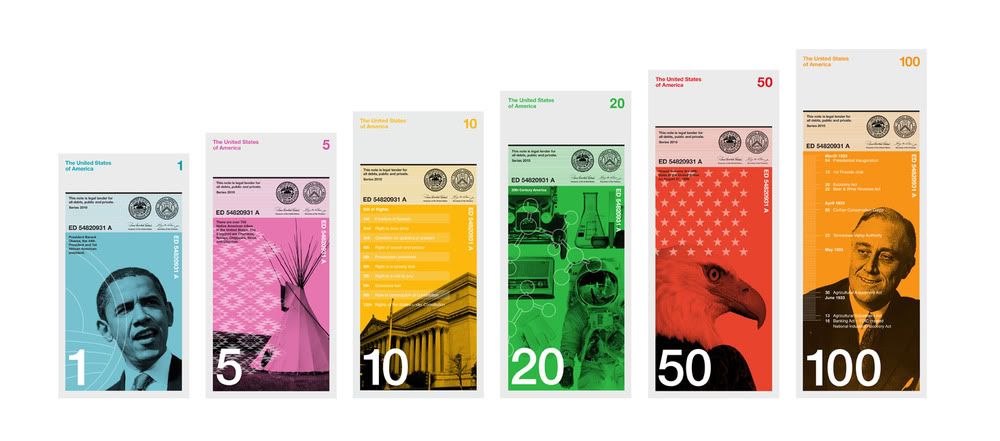
But lets focus on the design. Vertical? Yes, please! This makes sense and a whole lot of it. We do transactions vertically. We count it vertically, we put it into vending machines vertically, we hand it to one another vertically. This is smart. I also enjoy the different heights. As many articles have stated, it not only helps to see how much money you have when stacked, but this significantly helps the blind. That, is brilliant. I am slightly concerned with the white space. I love white space, I read a whole book on it once, but is it really effective when it comes to currency?
What are your thoughts?
{image cred: Dollar ReDe$ign Project and Dowling Duncan for the original idea}
Punctuate away,
Jessie-Lee


It's a tad too modern, and the US Dollar is such an icon in currency. We have Euros, and it's really nice to have "newer" designed currency, but I liked our old designs too. I don't mind currency being all vintage.
ReplyDelete